GUIDING VISITORS AND ENGAGING CUSTOMERS
A good guidance system offers visitors the orientation they need to reach their destination on the shortest route. Guidance systems are needed in a wide variety of environments, for example in public or semi-public buildings such as offices, museums, shopping centers, universities or underground car parks, as well as in outdoor areas such as parks or as tourist guidance systems in urban and natural areas.
Guidance systems not only provide orientation, but can also contribute to a strong image of a building or corporate brand.
EVERY ARROW TELLS A BRAND STORY
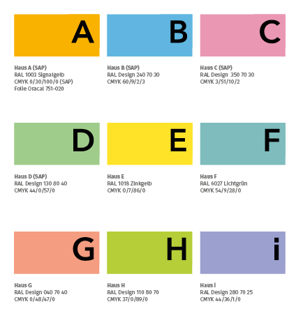
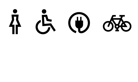
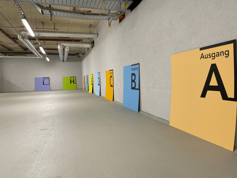
A consistent and concise color scheme, an individual design language of icons and graphics as well as a well-chosen typography make an impression and convey a brand experience!
Here, the corporate design of an existing brand can be extended into the space and make the brand physically tangible, or a completely new corporate design can be developed for a real estate branding.
A good signage system creates a communicative layer that covers the interior and exterior of the building. This informative horizon guides the user through the entire building or outdoor area smoothly avoiding interruptions and becoming a spatial component. The aim is to create an intuitive and coherent overall system that guides users almost subconsciously to their destination, like a handrail.
QH TRACK - BRANDING THAT WRITES HISTORY
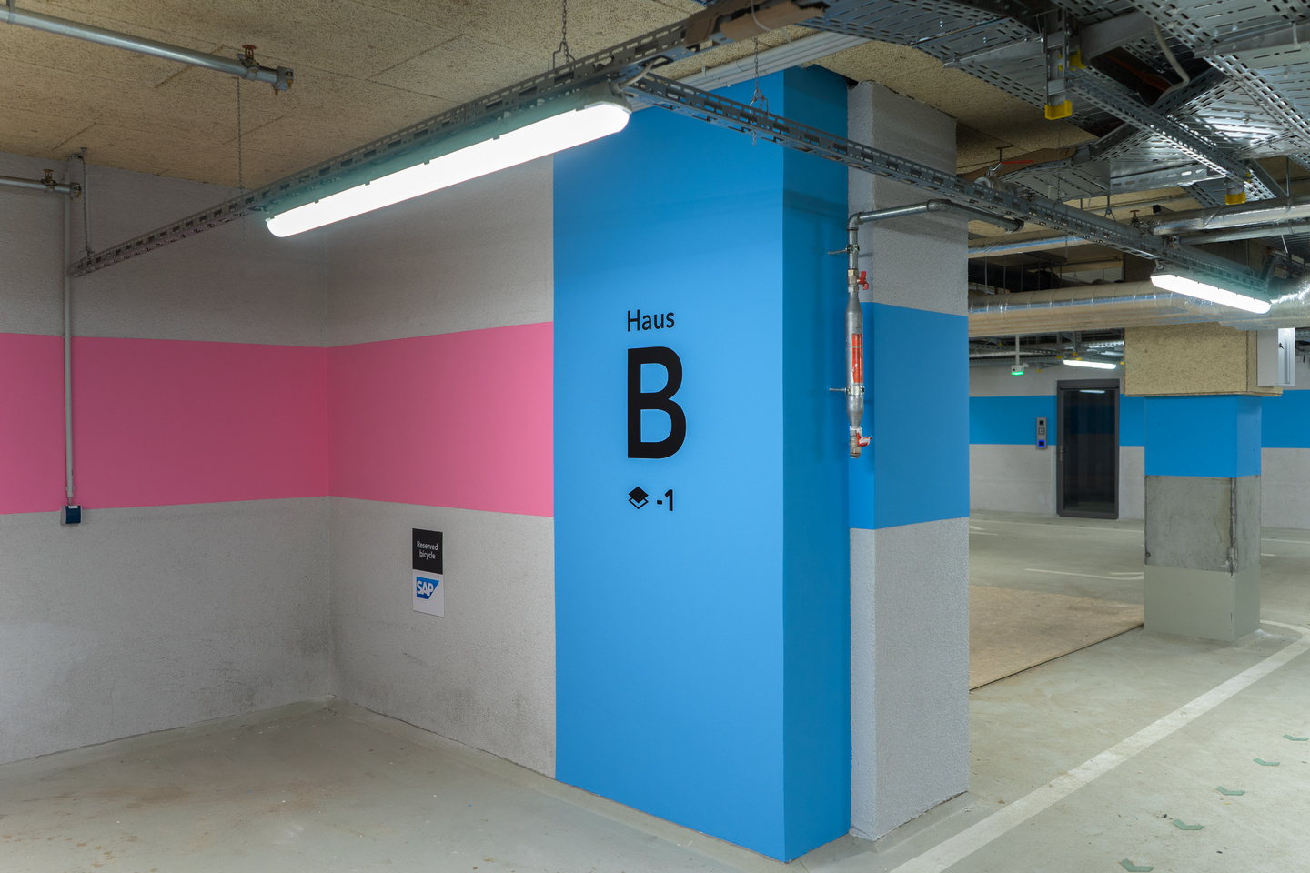
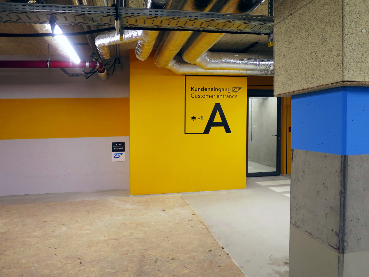
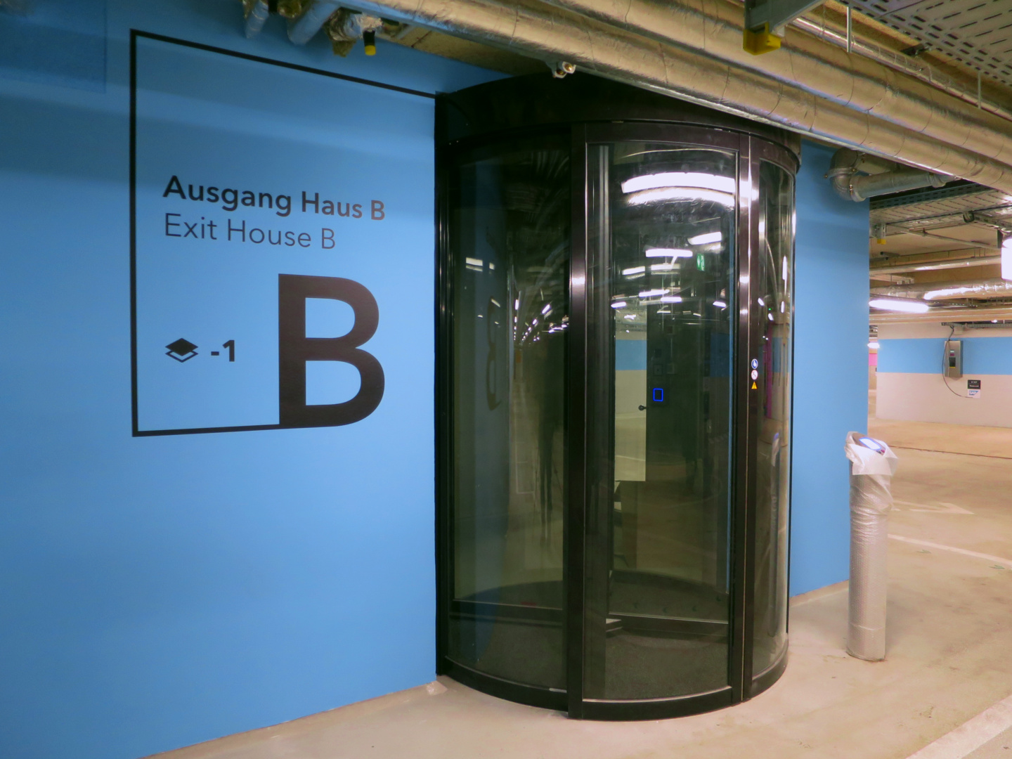
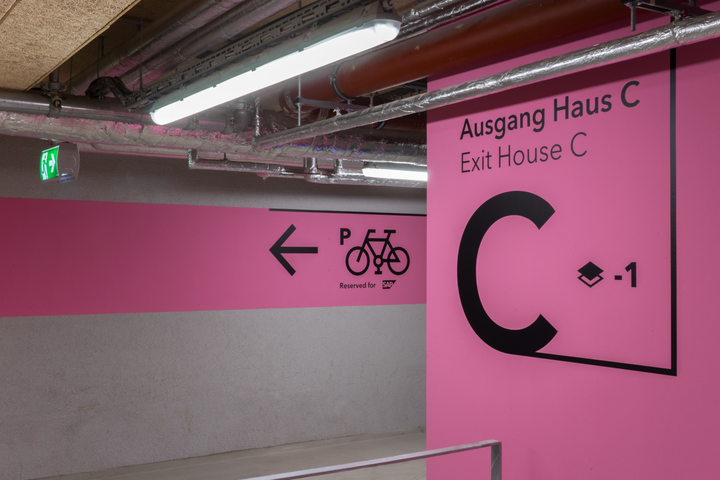
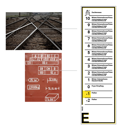
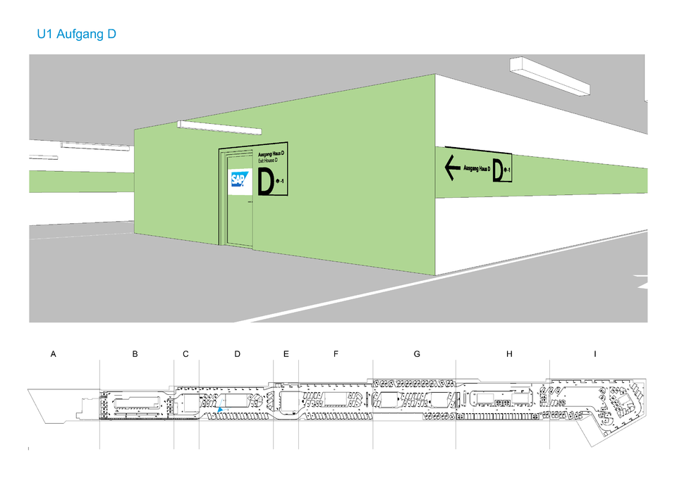
In the currently ongoing QH Track project, the visual design of all elements of the guidance system is based on the history of the site. The building complex is part of the newly developed Quartier Heidestraße - a construction area on a former freight site near Berlin's main train station. Originally characterized by its railroad tracks, the site is now being transformed into a modern office city.
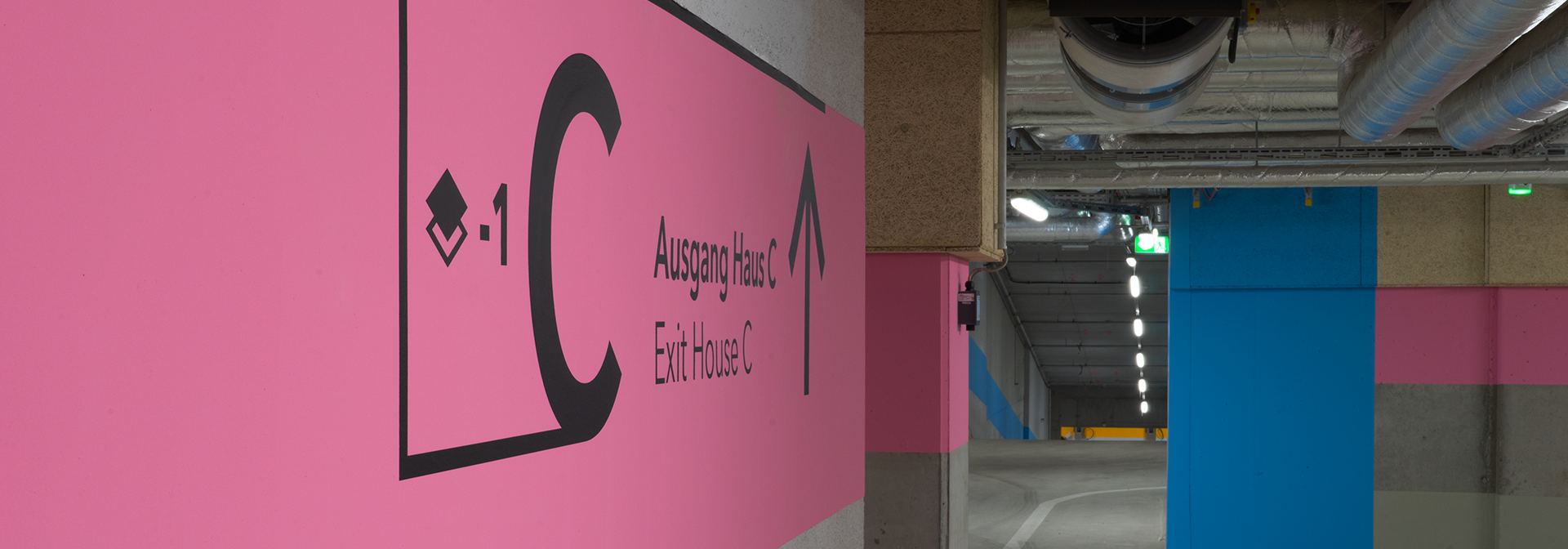
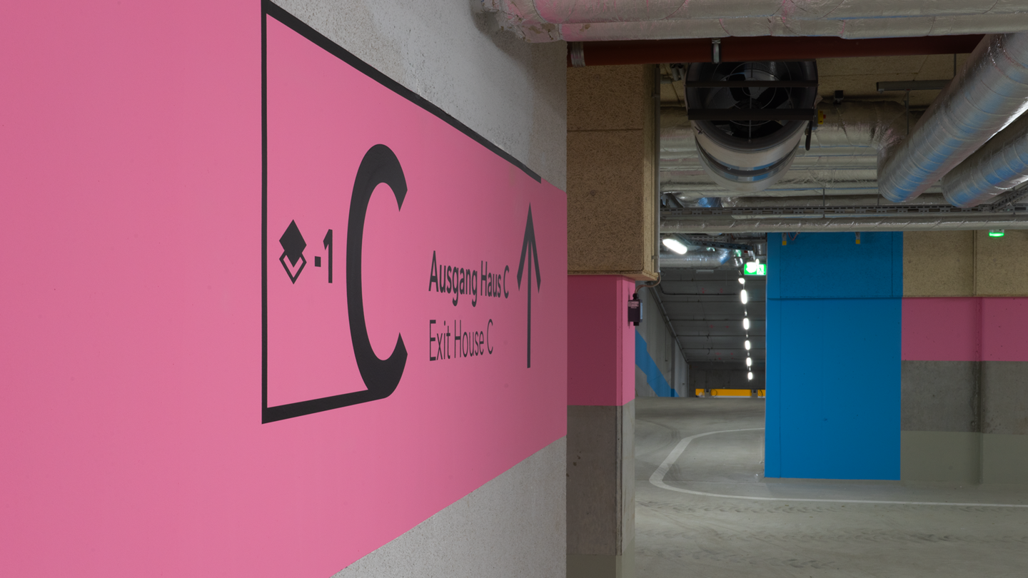
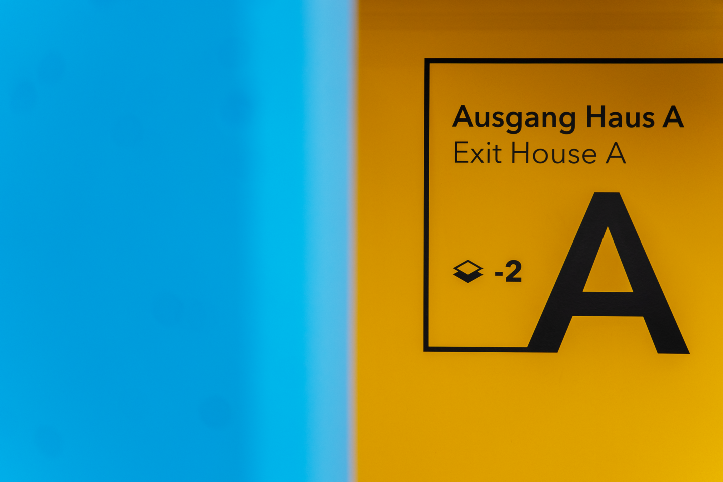
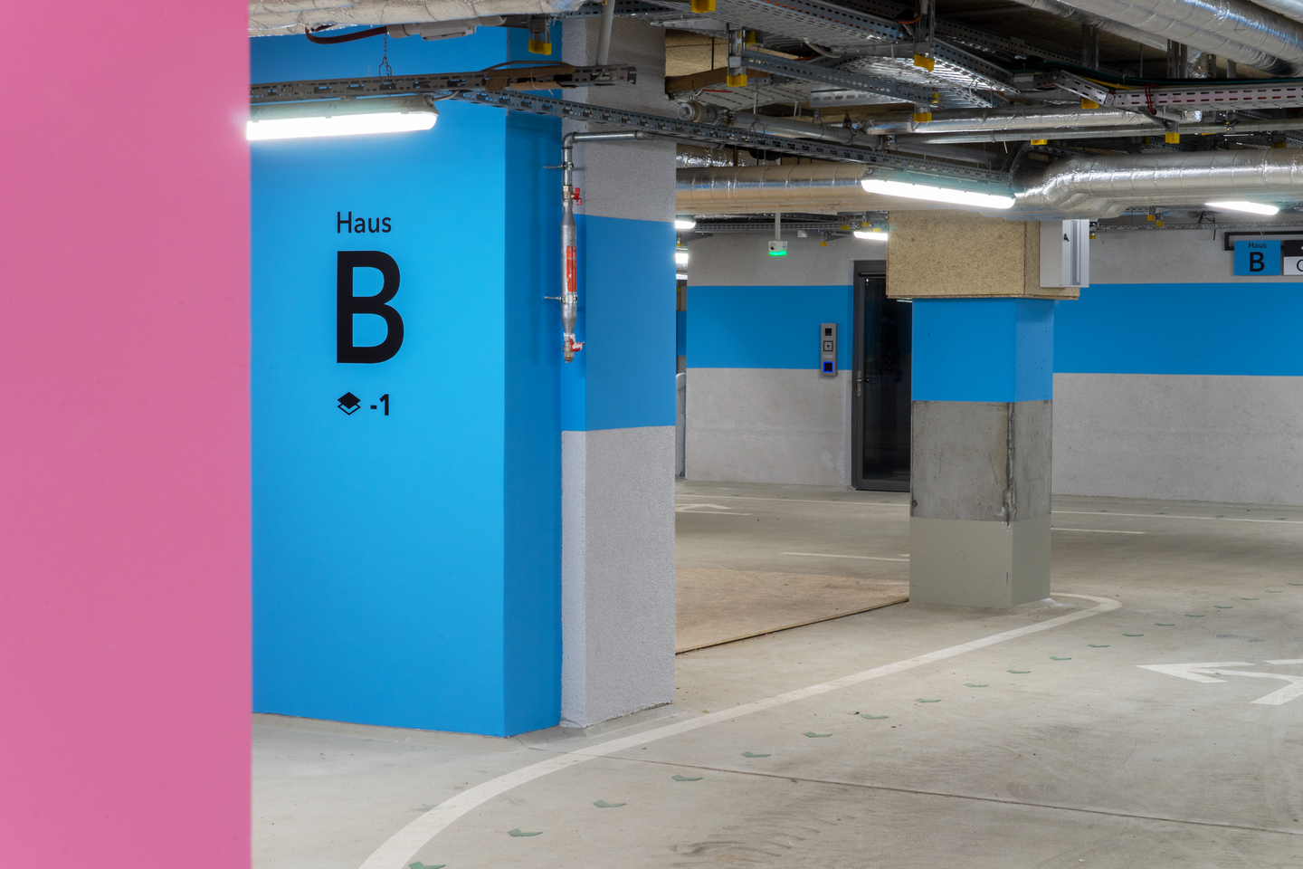
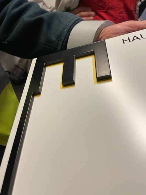
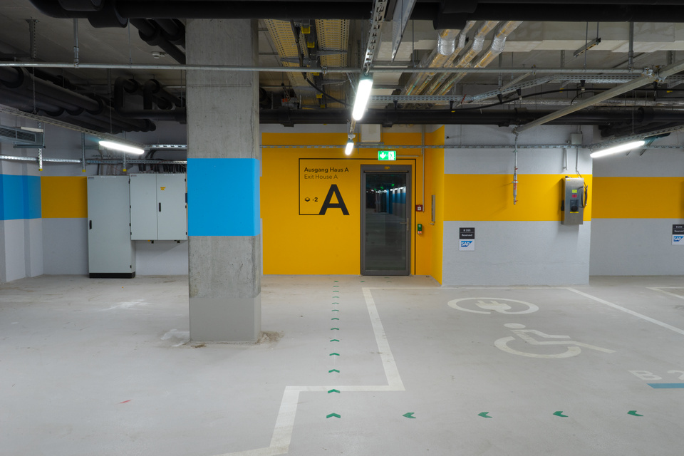
The fundamental design elements of the guidance system are lines and frames. They refer to the history of the "Heidestraße" site as a former railroad and freight area. The lines of the design elements refer to the rail network of the railroad area, which opens in the direction of movement. Format surrounding frame elements also quote the clearly structured inscriptions on freight cars. This concept is consistently recognizable on everything from large wall graphics to the small-format door signs.
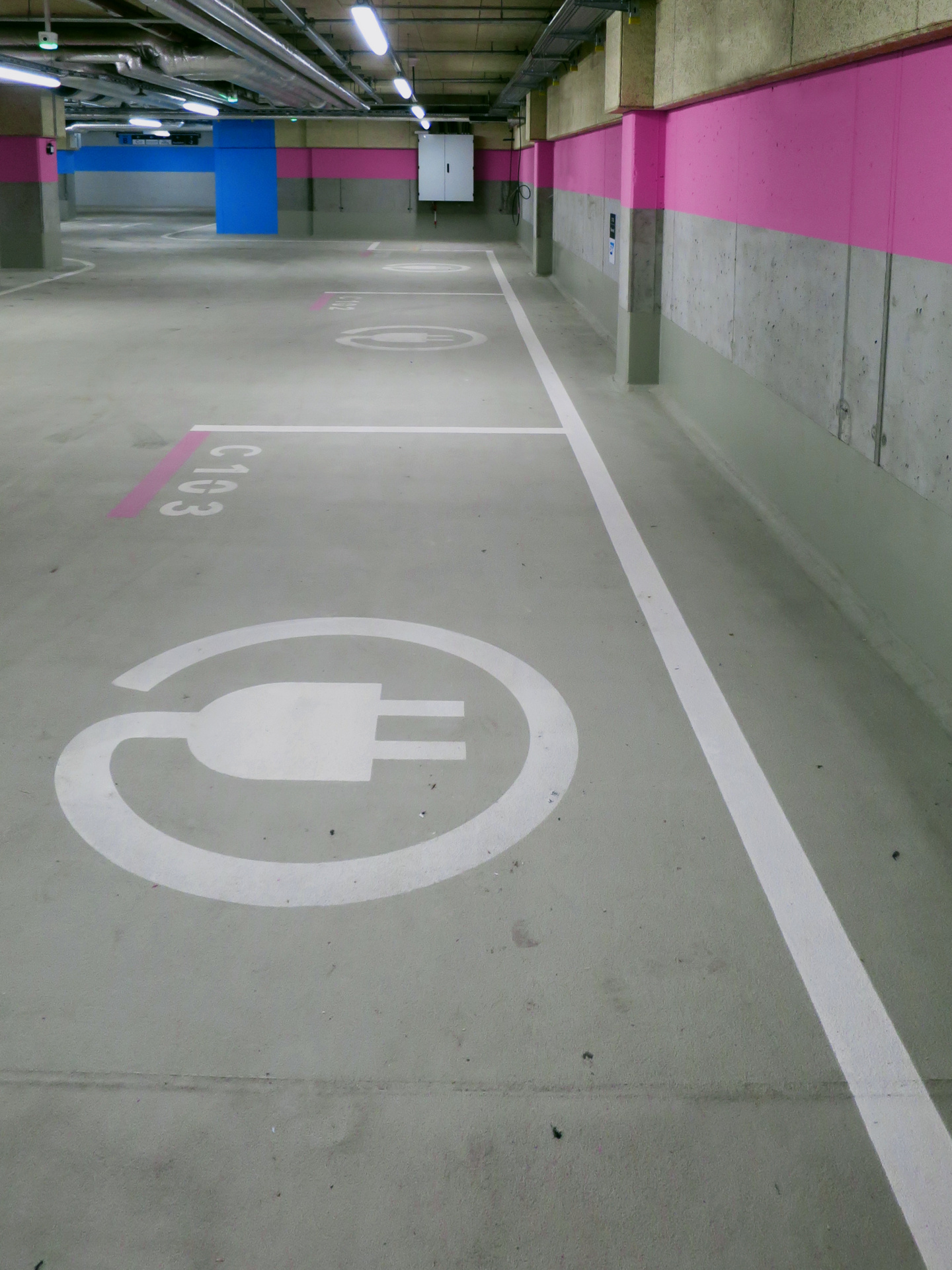
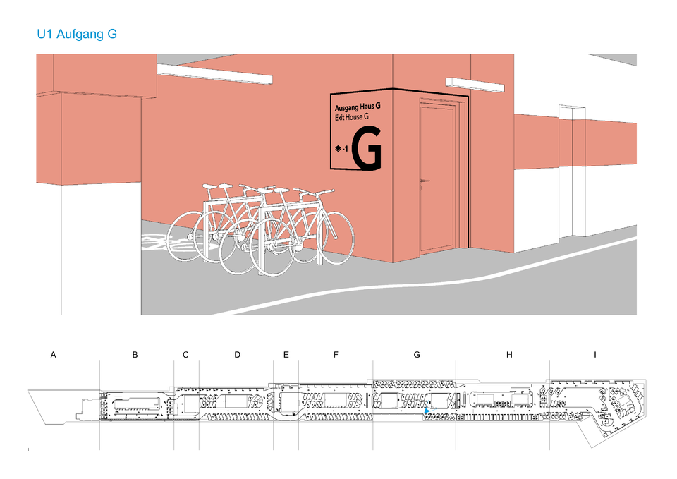
Since the project is still in the construction phase, the current photo documentation so far only includes the underground parking lot (Berlin's longest!). Further elements of the guidance system include the exterior and interior design of the entire building complex and can be published after completion.
