Individual elements that can be scaled
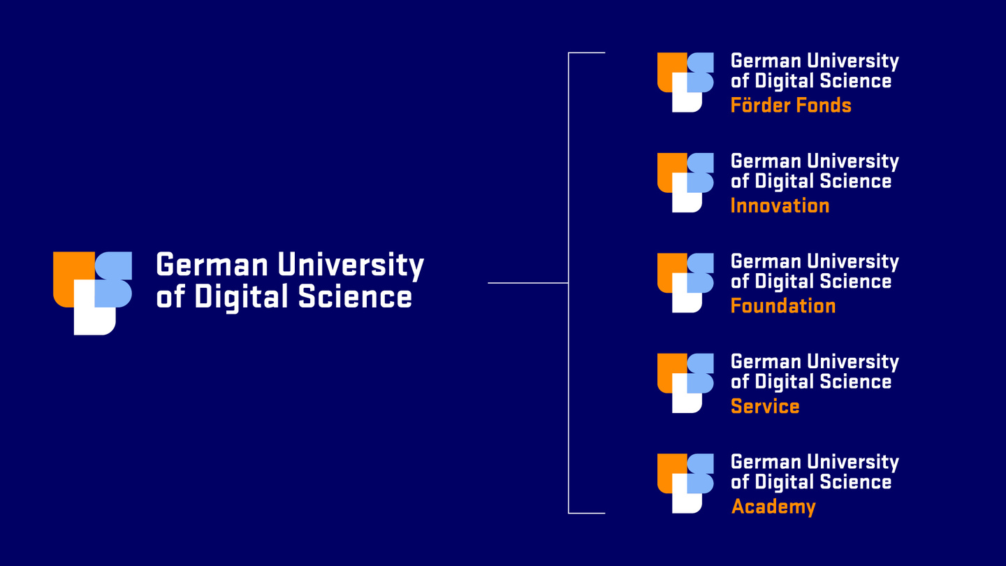
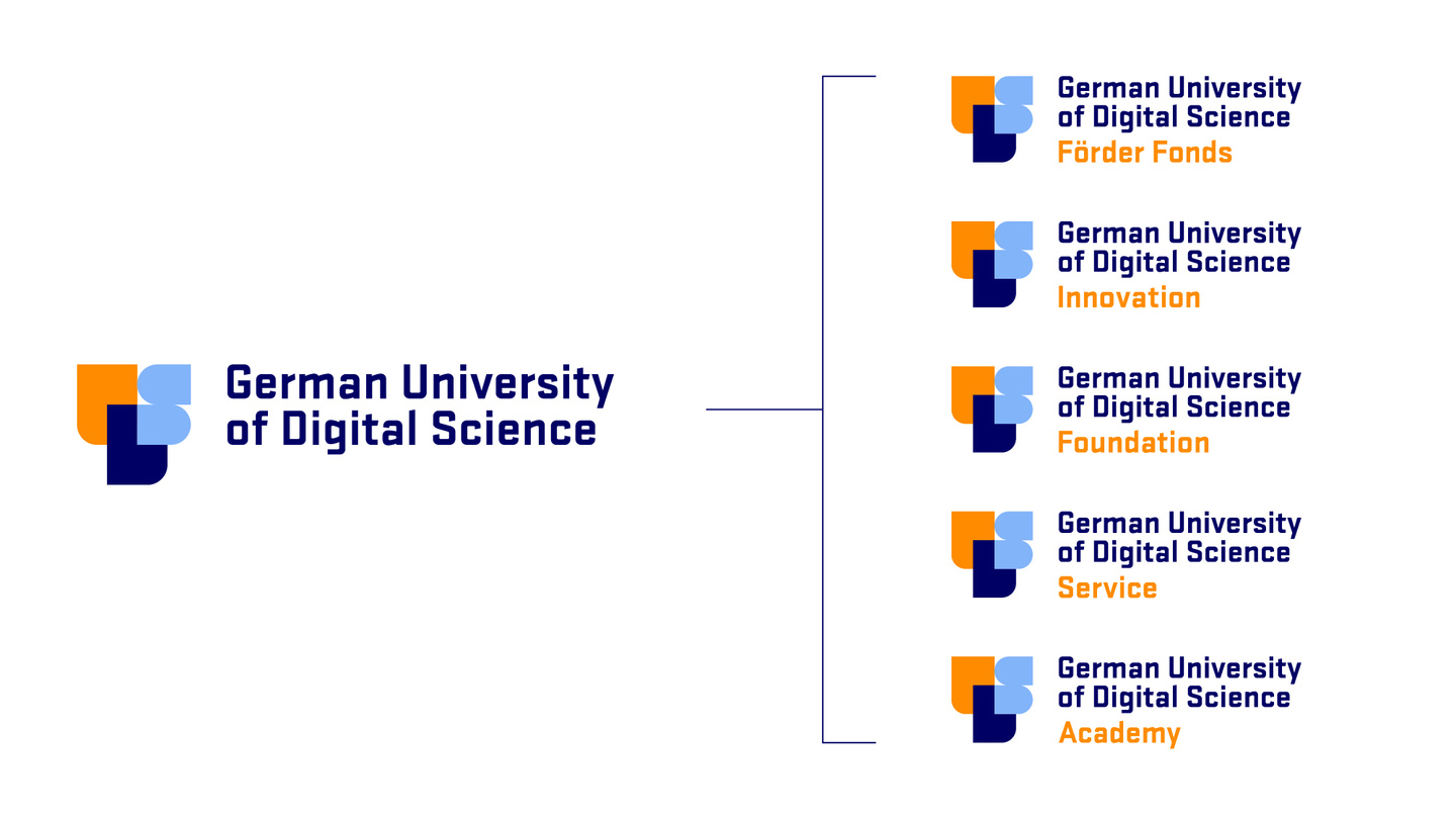
We designed a logo architecture for the different business units of the university cosmos that ensures clear allocation and recognisability.
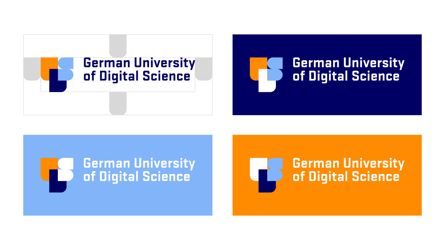
The logo is stable and can therefore be used on all digital applications as well as in the miniaturisation of social media channels.
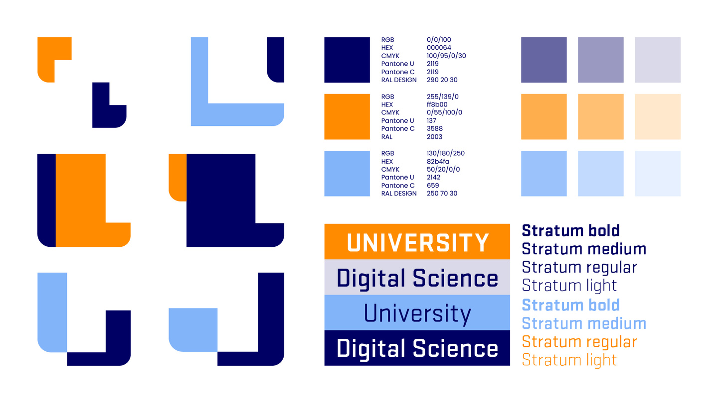
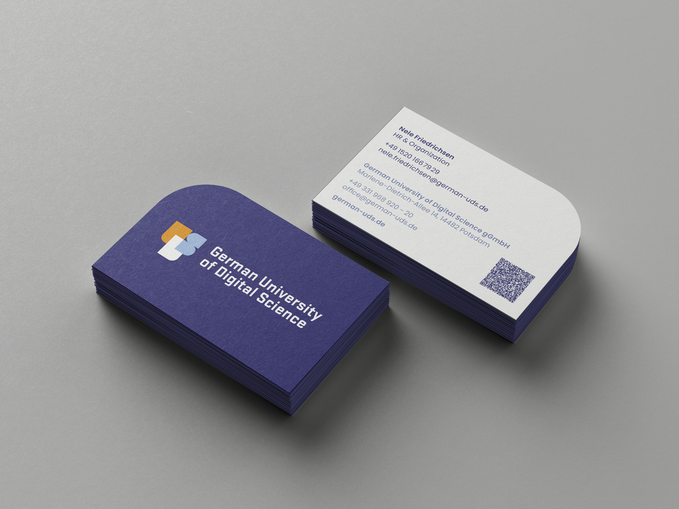
The round visual shapes derived from the logo provide the template for all other design elements.
A modern colour palette that promises innovation
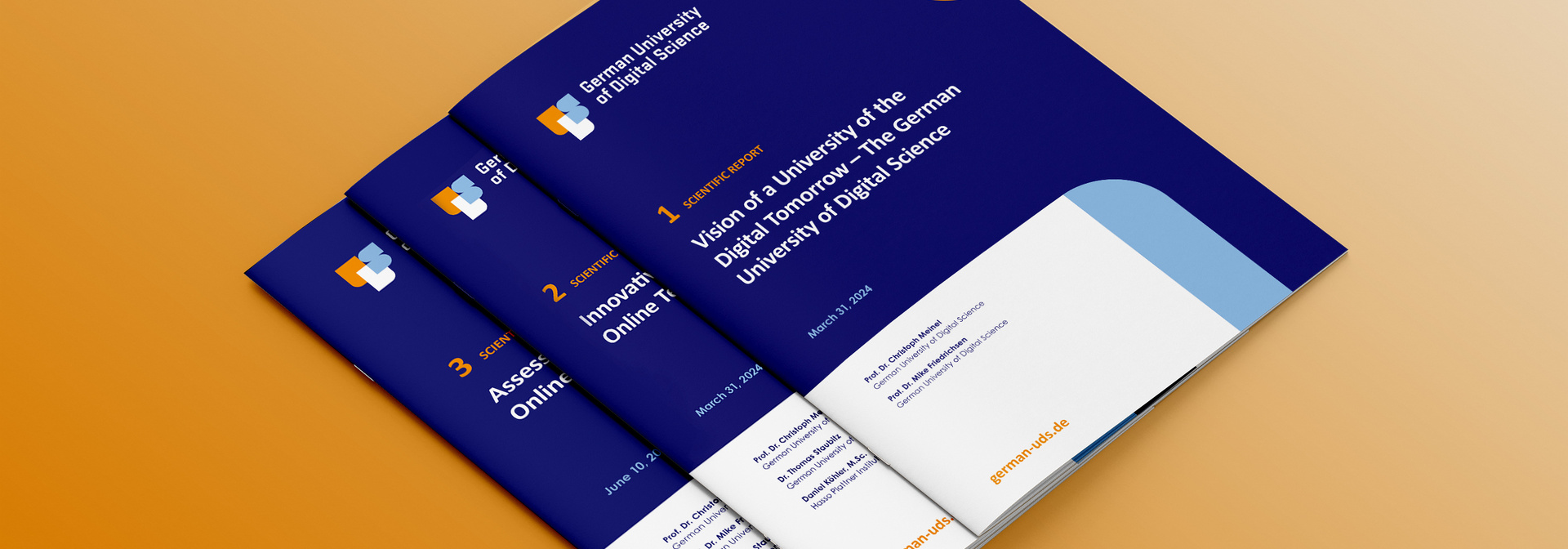
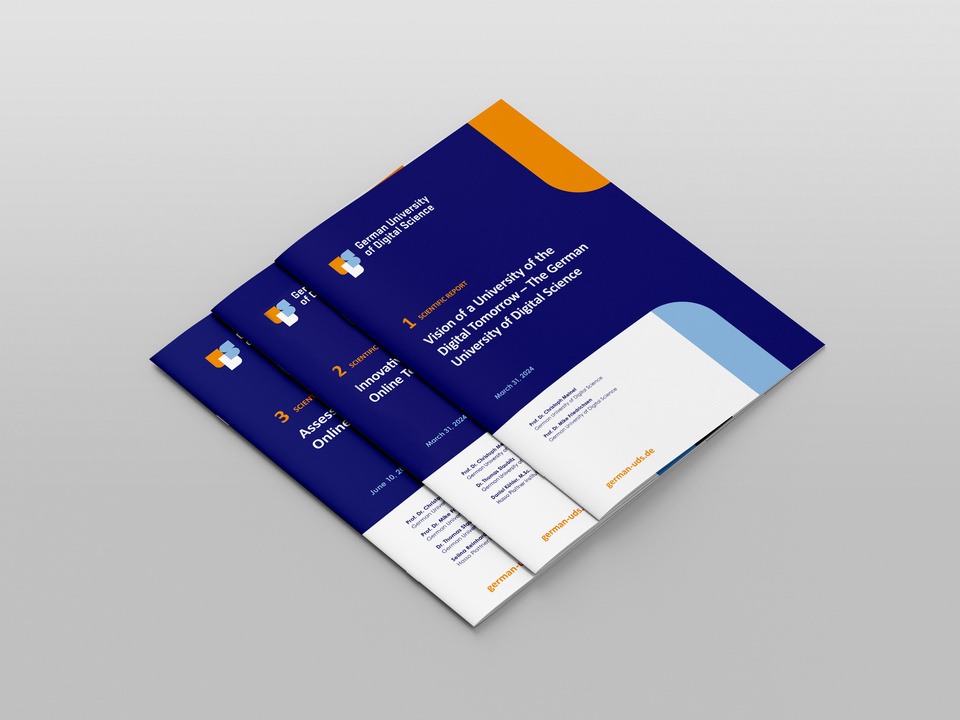
The colour palette should emphasise the positioning - something between academic seriousness and the visionary digitality of the university's DNA. Our result is a mix of colours that works well on screens and is also easy to implement in print. The mix of dark and light colours allows for strong headlines, the setting of accents or clear infographics in equal measure.
The colours are fresh, digital and as new in a university context as the concept of the German UDS.
