How we bring the GASAG brand into the space
GASAG AG is the main energy supplier in Berlin and Brandenburg is, which also makes it one of the largest employers in the region. When GASAG planned to move into its new corporate headquarters on the EUREF campus in Berlin, we were given the task of bringing the GASAG brand into the space for employees and visitors alike. Both internally and externally, the brand and everything it stands for was to be made tangible. It was to accompany everyday working life in an authentic and positive way and to motivate people.
We seized the opportunity to apply the GASAG brand elements in various areas. We took them apart and put them back together again, developing innovative possibilities to use them and always with the brand and its values in mind.
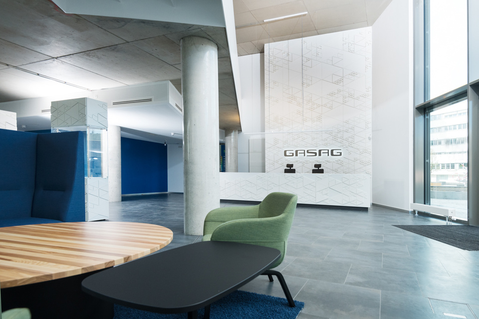
The lobby: brand as far as the eye can see
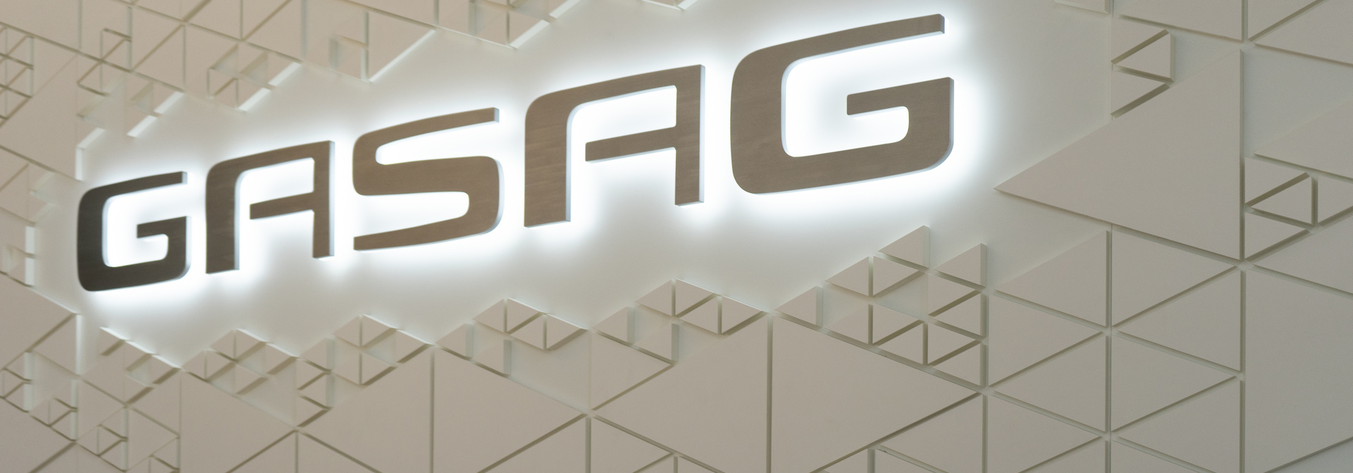
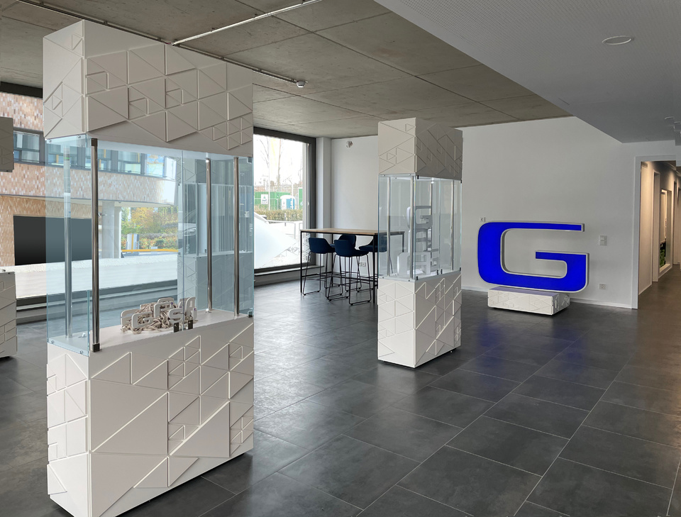
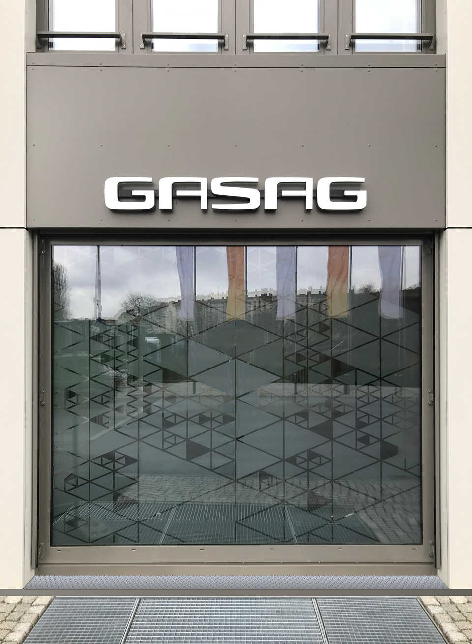
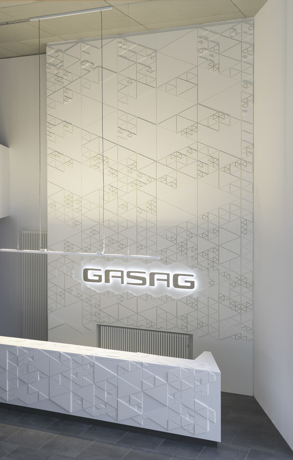
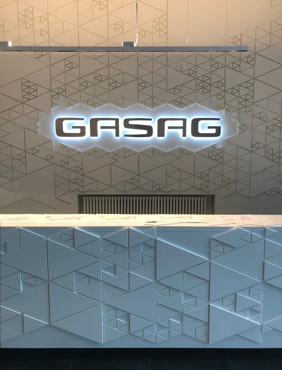
The lobby is the spatial business card of the GASAG brand, where employees start their working day and visitors enter the brand world for the first time. Only in the rooms of the headquarters can the brand be experienced spatially without compromise and already presents itself as a host from the outside on glass front which is laminated with a branded design. The first step inside is the first step into the brand world which is particularly prominent in the lobby. Because in contrast to the offices, which are mainly used by employees, the lobby as a public space is a walk-in shop window for the GASAG brand. We therefore placed a special spotlight on the entrance area and let the brand speak in a variety of ways on walls, furniture and signage.
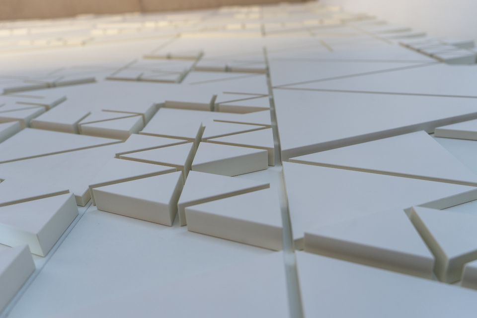
We derived materials, shapes and colors from the brand's corporate appearance and developed a spatial equivalent from GASAG's two-dimensional corporate design and logo.
An innovative triangular structure, which is related to the figurative mark, results in a dynamic construction kit that we can use in a variety of ways. We play with the change of light and shadow of the three-dimensional brand graphics and create an exciting experience.
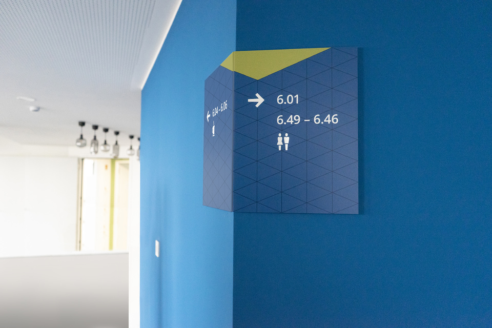
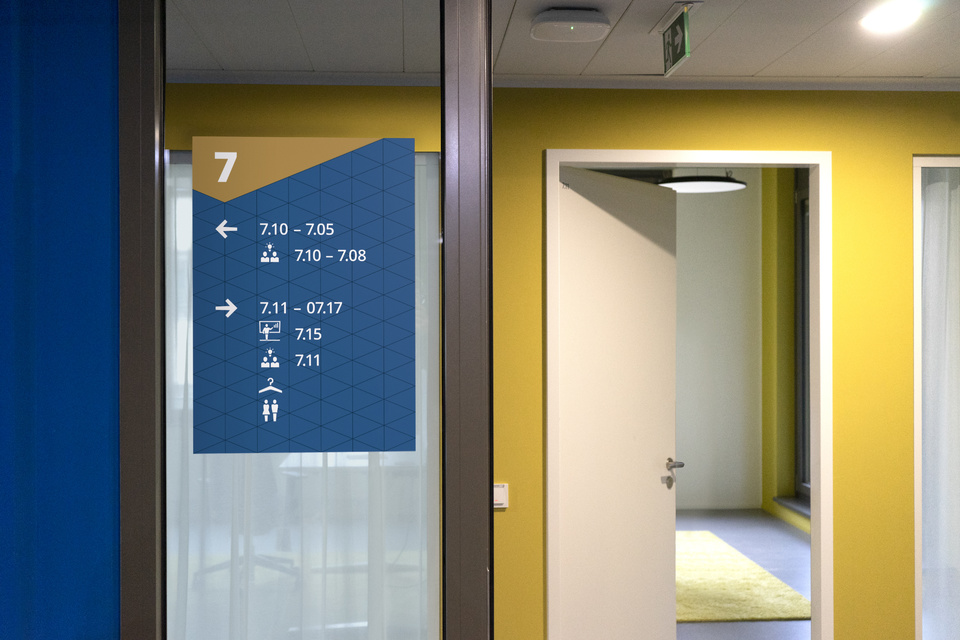
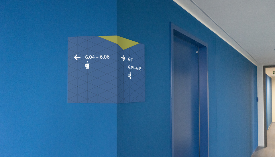
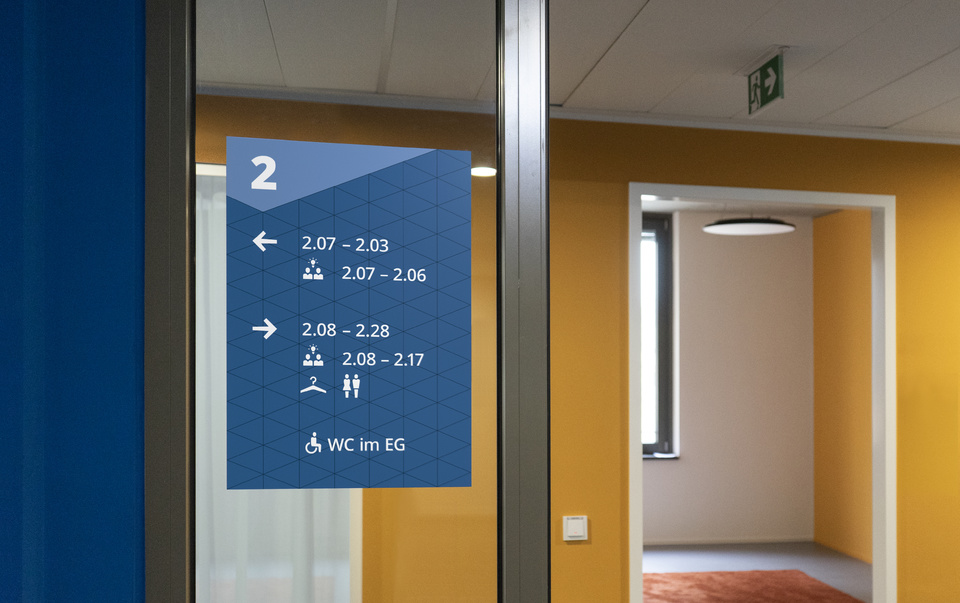
SIGNAGE SYSTEM: the brand guides through the building
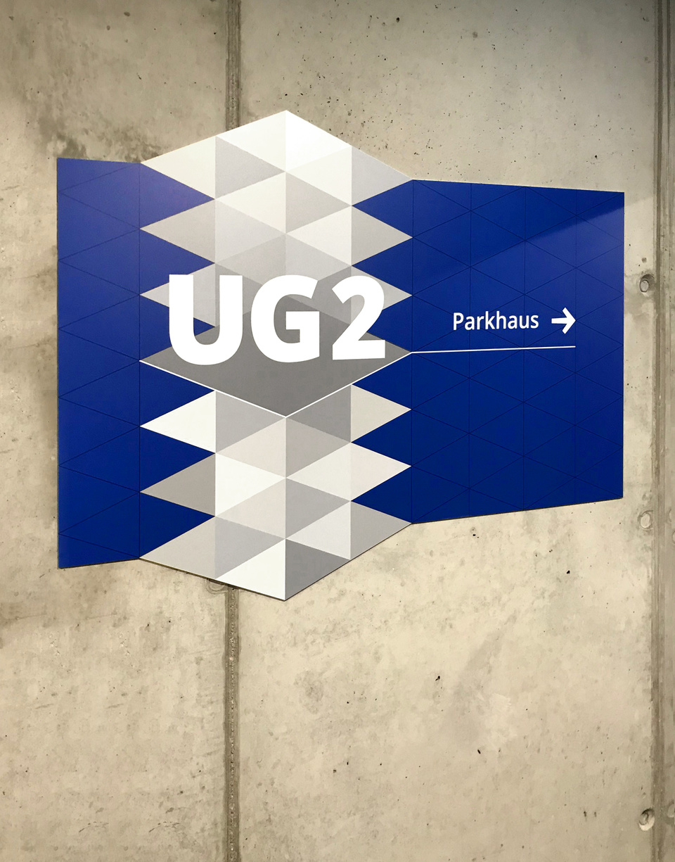
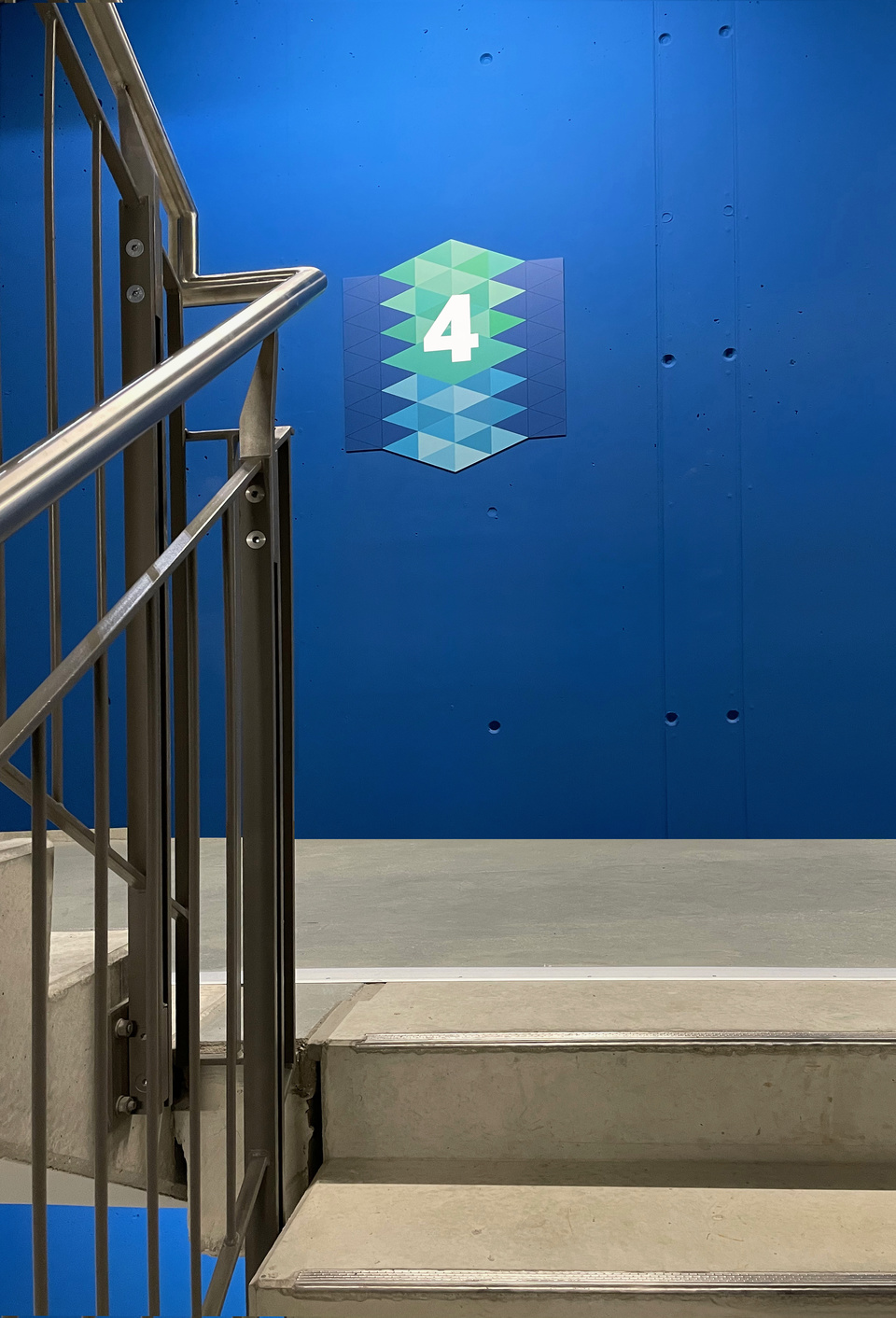
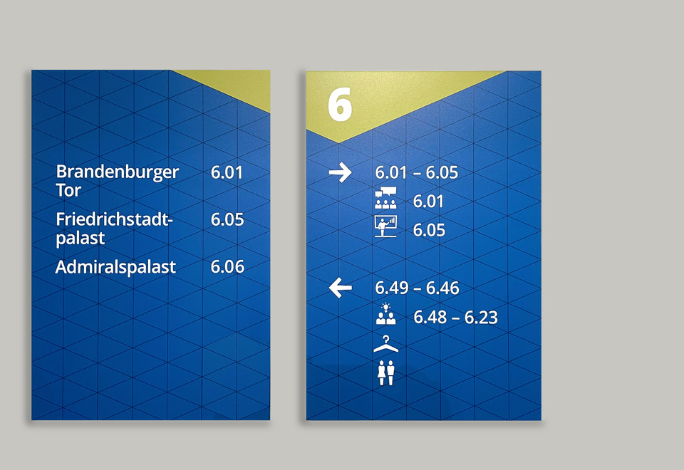
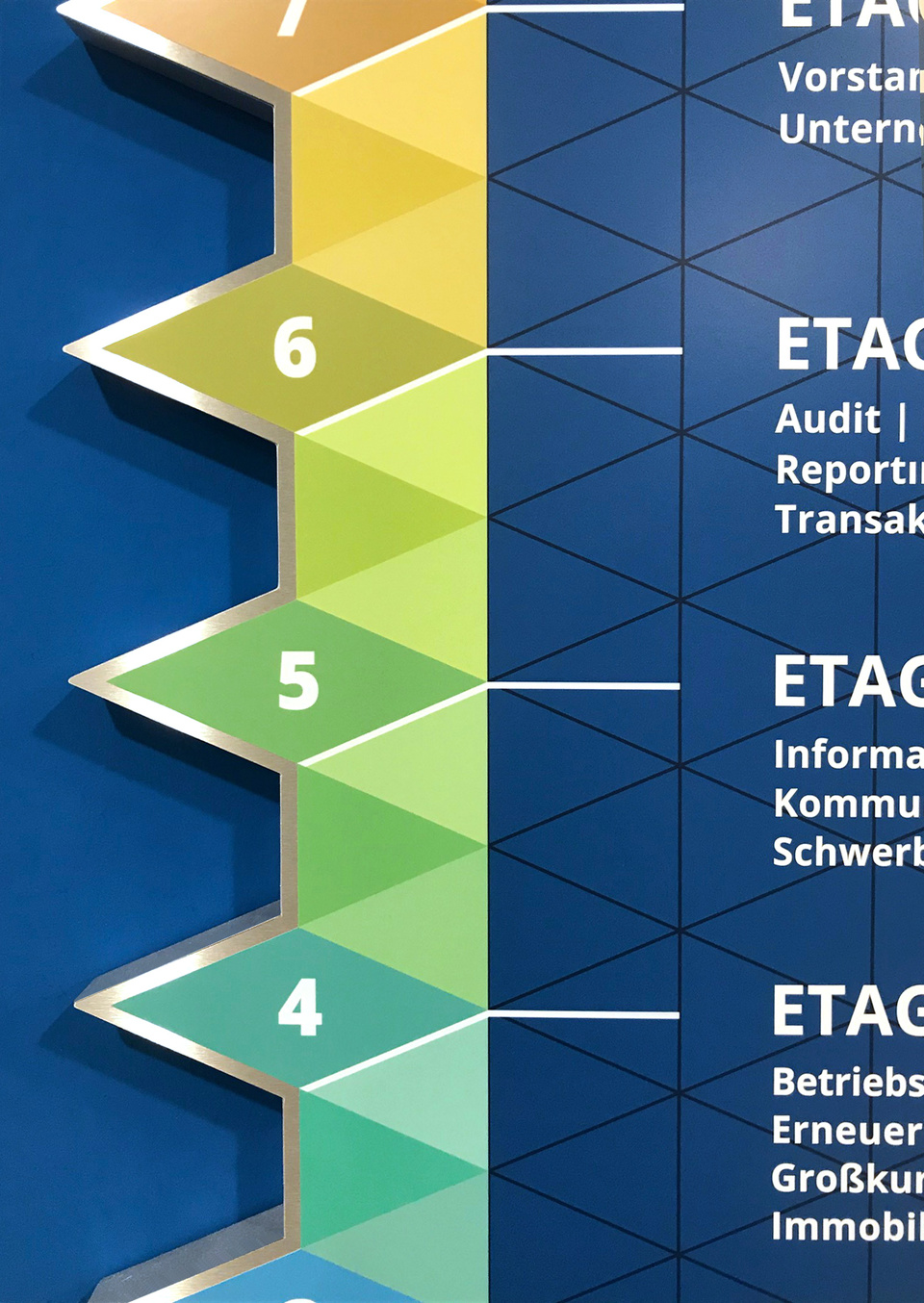
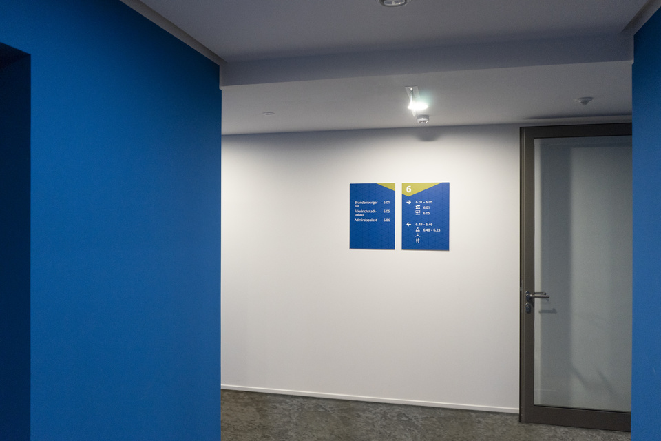
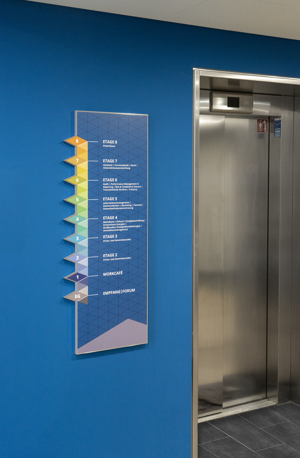
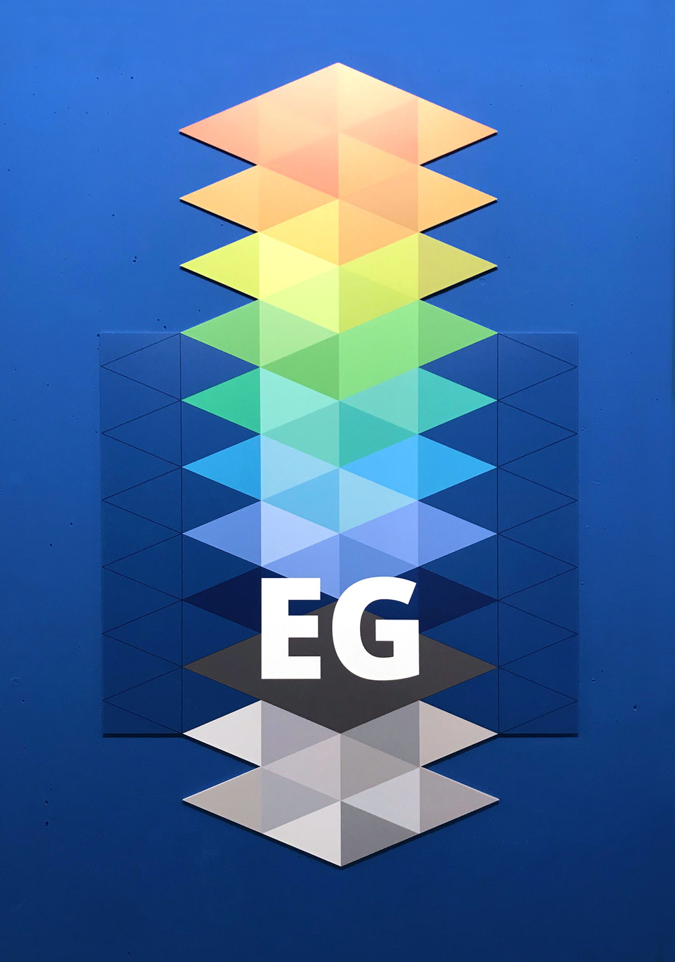
The signage system welcomes all visitors up front in the lobby and continues on all floors in different formats and shapes. As visitors look for their target location and move trough the space, their eyes are constantly drawn to the guiding signage. We take the opportunity and let the brand appear as host, by developing the graphics of the signage system using GASAG's corporate design elements. We use the triangular structures and brand colors and interpret them according to their task as spacial guides. The result is a graphic system that quotes space and three-dimensionality, as the height of the floors can be recognized in the design.
In addition, we have developed a pictogram set for barrier-free orientation and the labelling of areas and rooms.
The guidance system consists of: Floor plan, floor marking in the staircase, floor signs in the office area and room signage.
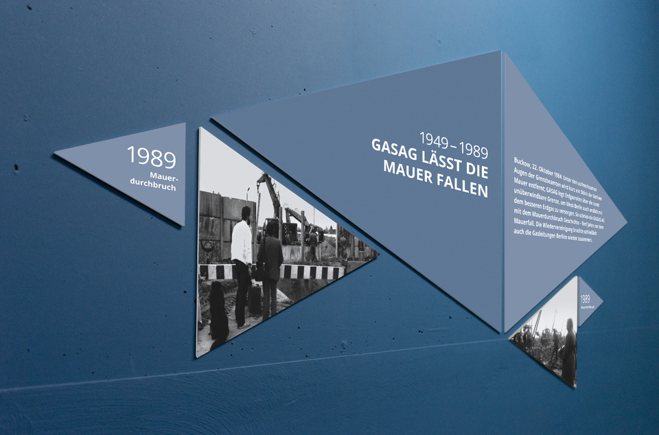
The staircase: a journey through the history of GASAG
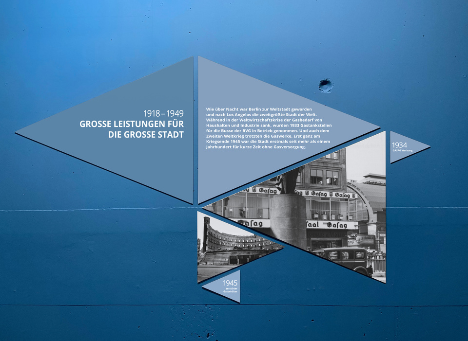
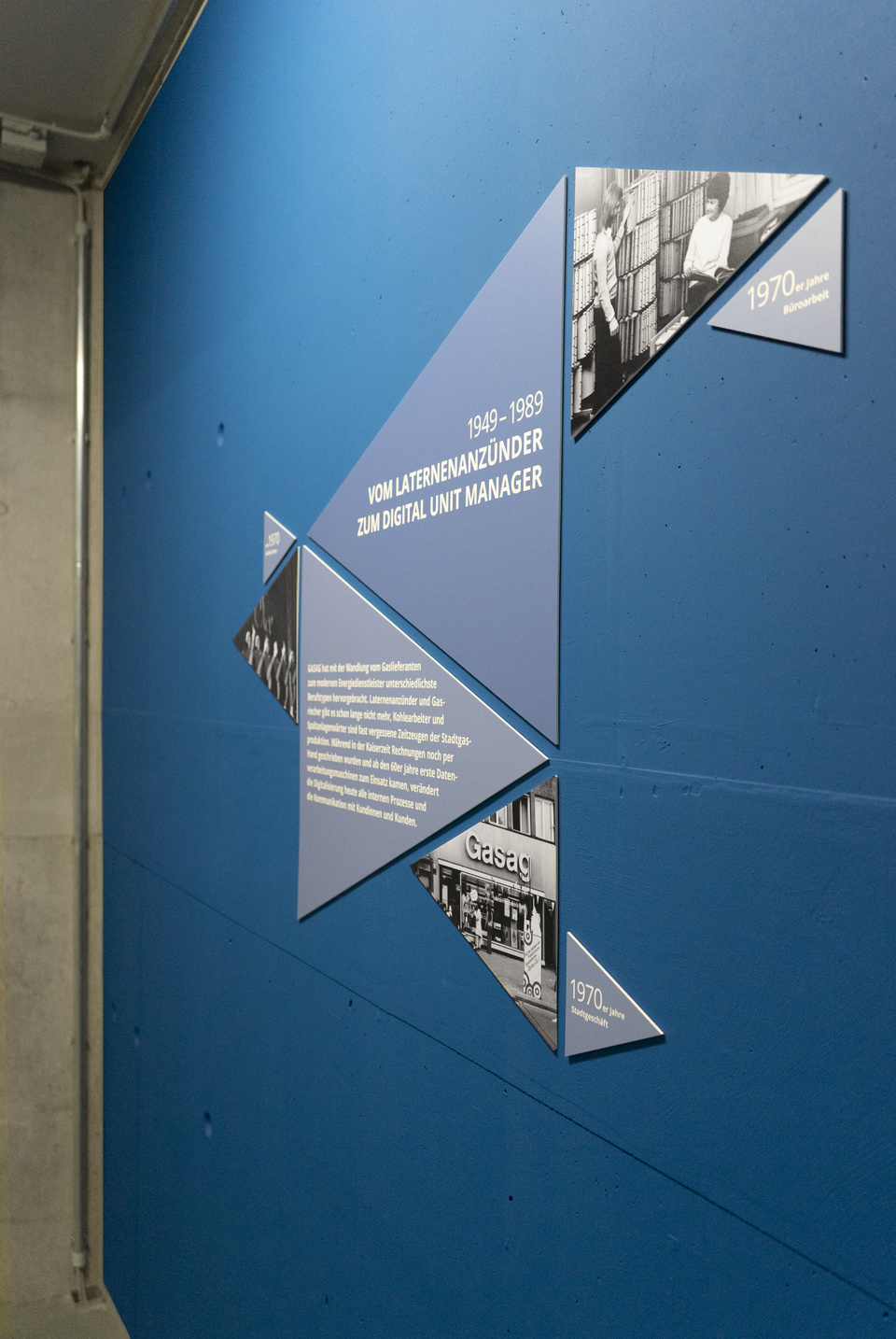
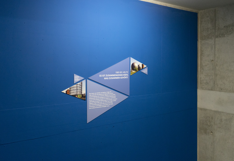
We wanted to make the use of the staircase to be particularly interesting, since the ascent, hard enough on its own, should be fun. So wee designed displays for storytelling on which the history of GASAG is told. Images and text convey new information and allow a little break in-between the floors.
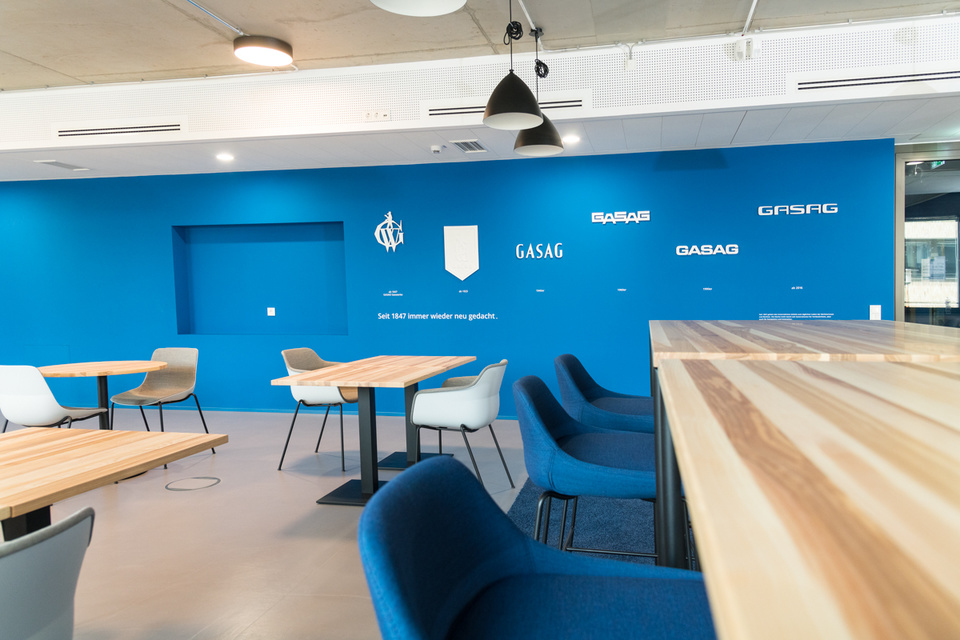
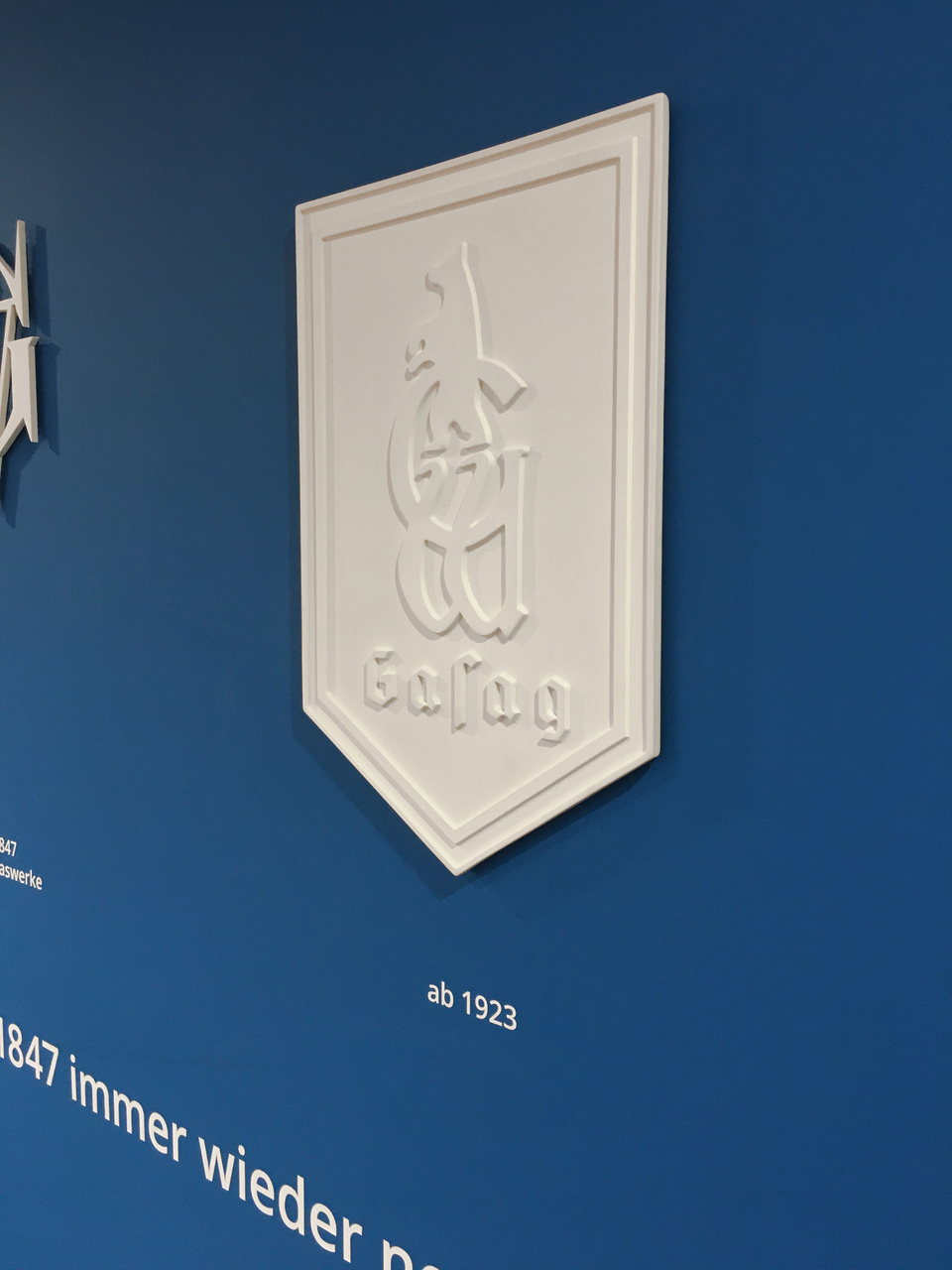
The workcafé: logos made of porcelain by KPM
The café is part of the lobby, so we seized the opportunity to tell people drinking their coffee a little more about GASAG AG. We developed a wall display showing the history of the logos from the beginning to the present day.
As a traditional Berlin company, a central component of GASAG's DNA is the city of Berlin. In order to cleverly package this brand value, the logos were created in cooperation with another traditional Berlin company, the Royal Porcelain Factory KPM, worldwide known and appreciated for its handcrafted porcelain. Thus, the logos of the café wall are also made of porcelain as individual pieces.
